MoodHaus: A Complete Brand System
MoodHaus reimagines the traditional practice of burning incense for the modern home, transforming it into a multi-sensorial experience designed for everyone and every space. Collectible and design-forward, the products are as decorative as they are functional.
CONTEXT
3-Week Branding Project · Parsons School of Design
TEAM
3 Designers
YEAR
2025
INDUSTRY
Wellness & Lifestyle
TECH STACK
Adobe Illustrator
Figma
Canva
Miro
ChatGPT (mockup generation)
MY ROLE
BRAND STRATEGY
VISUAL IDENTITY DESIGN
LOGO DESIGN
PRODUCT DESIGN
MARKET RESEARCH & INSIGHTS
The Challenge
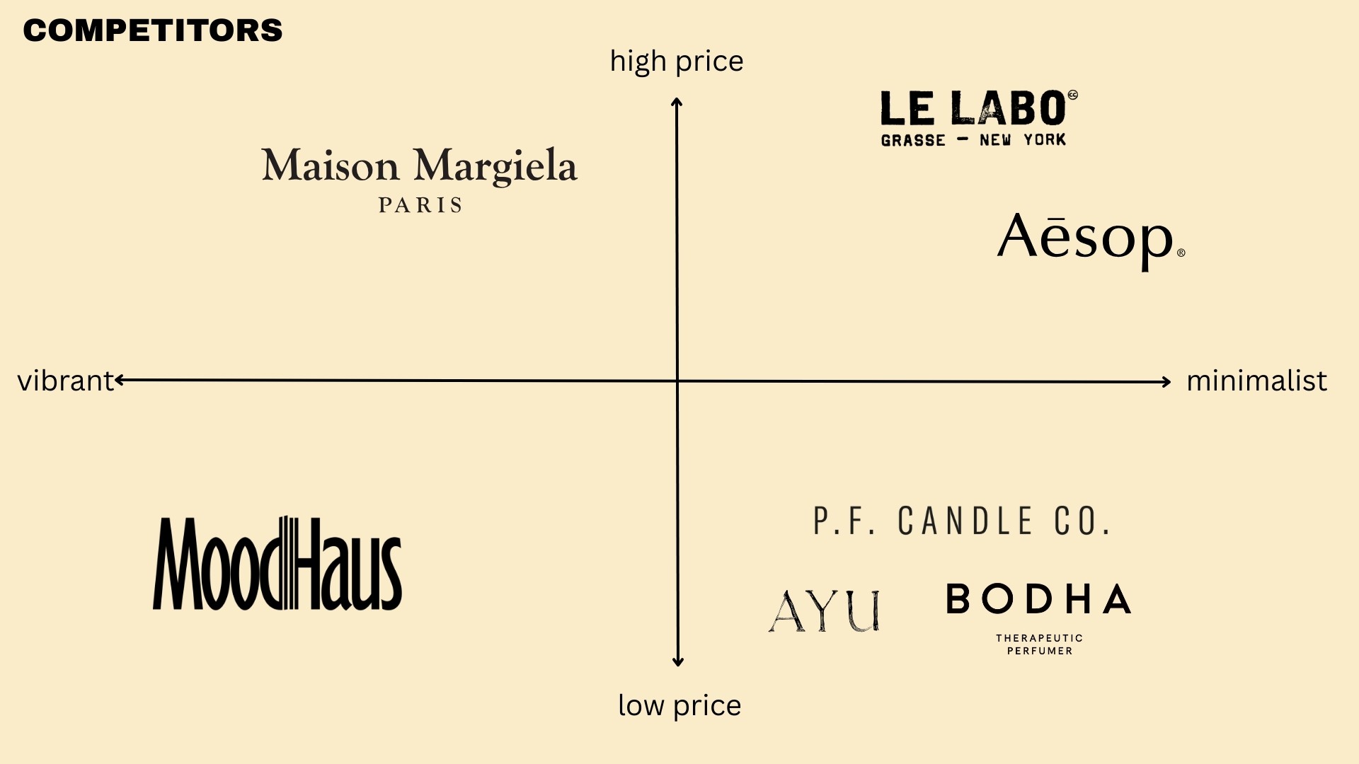
While candles and reed diffusers dominate the modern scent landscape, incense has begun carving out its own space, but generally falls into two categories: novelty designs sold at high prices and positioned as luxury items, and specialized holders requiring prior expertise.
The Strategy
Through market research and competitive analysis, we identified an opportunity to position incense alongside candles and reed diffusers as part of everyday scent rituals. Rather than treating it as a niche or luxury, we anchored the brand on both accessibility and design — a practice with deep, lasting roots, reimagined for the modern home.
The Solution
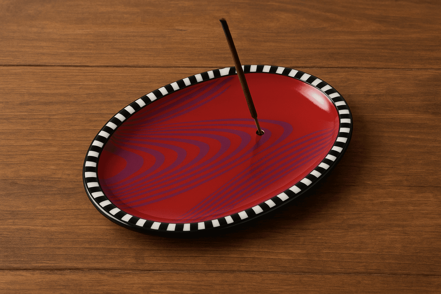
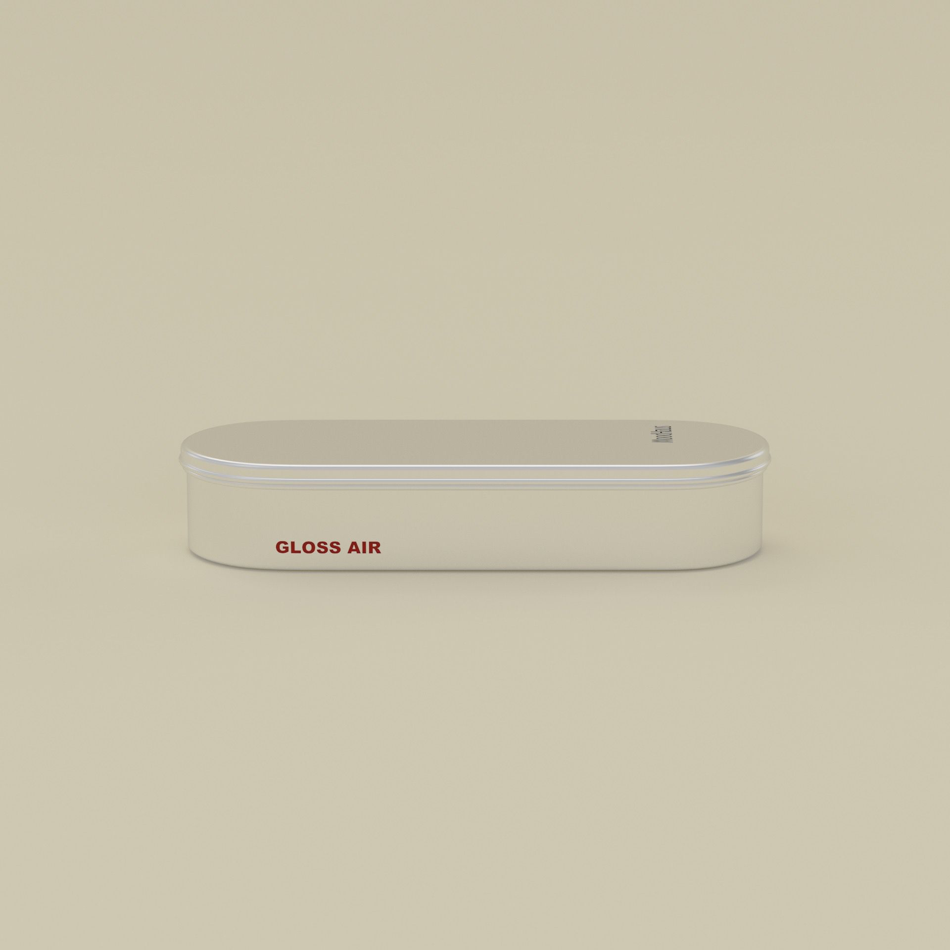
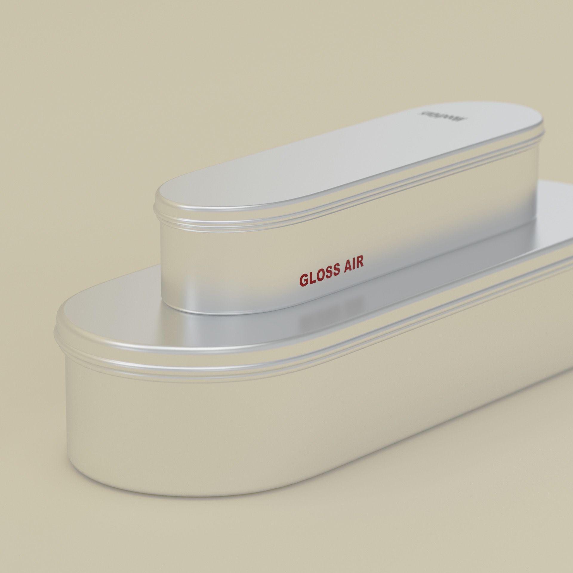
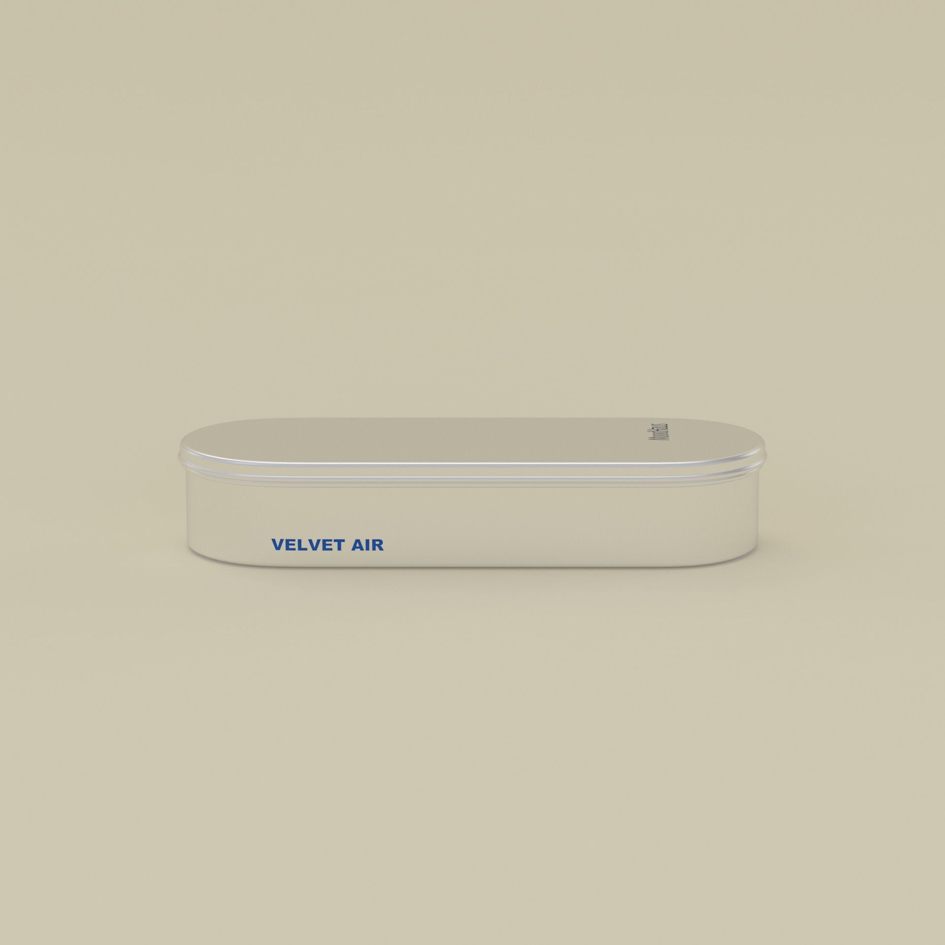
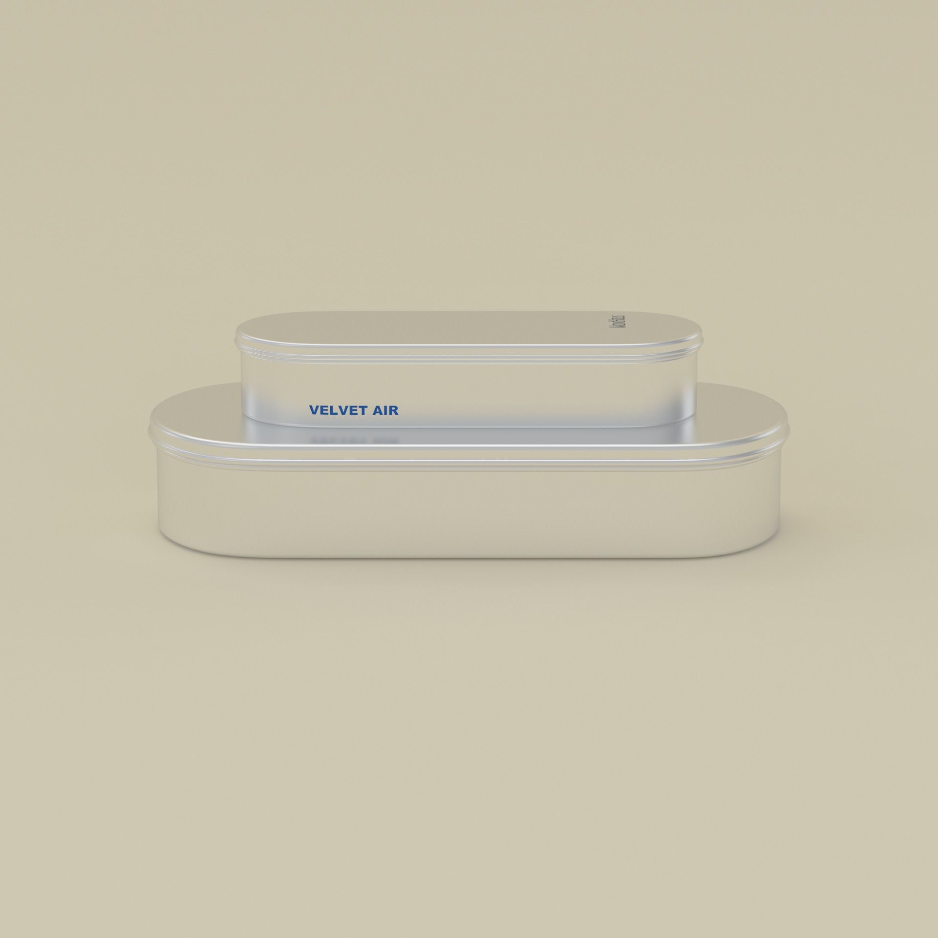
The product line treats incense with the same visual and sensorial focus as any object in a considered space. Each piece holds its own intuitively and visually — designed to be seen as much as used. The cases are minimal, giving the holders room to be vibrant without being overwhelming. Cases are collectible and stackable, allowing both display and function without taking up extra space.
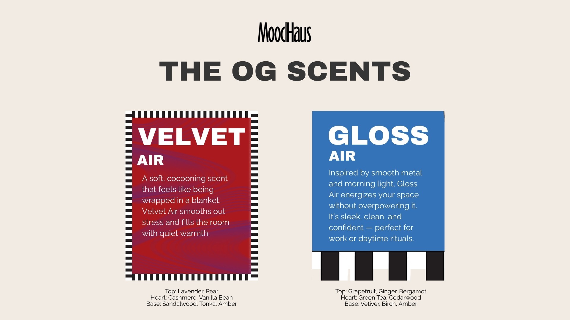
The brand carries that same consideration into scent: the most lasting and emotionally evocative of the five senses. The two core scents connect with users through feeling and association, engaging sight and smell for a multi-sensorial experience.
VISUAL IDENTITY SYSTEM

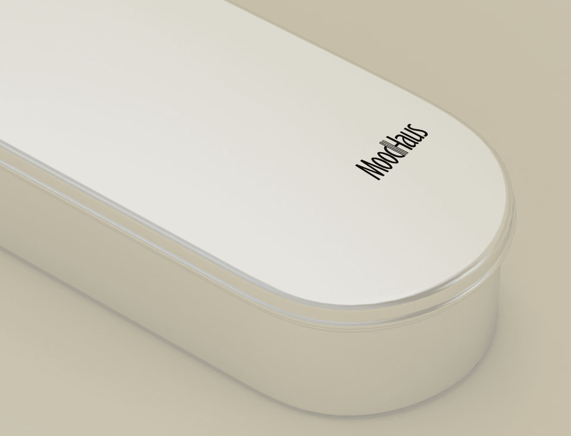
We built incense directly into the logo by doubling the strokes of the 'd' and 'H' — right where 'Mood' meets 'Haus'. The strokes read as a cluster of incense sticks, letting the mark carry the product's meaning.
TOMOATO RED
#E83B2D
COBALT BLUE
#0047AB
SUN YELLOW
#F6B610
HERITAGE GREEN
#098942
WARM CREAM
#F3E6CC
INK BLACK
#1A1A1A

LOGO & HEADING 1

HEADING 2

BODY
THE PRODUCT LINE